Back to projects

Automotive & logistics, manufacturing

Škoda Auto: A production planning app designed from scratch

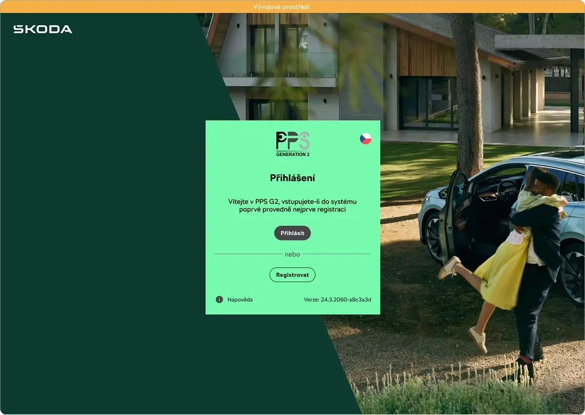
PPS G2 is a system for capacity planning and production tracking at Škoda Auto, which I was designing from the very start. It replaced the paper processes operators used to work with on the line, and the goal was to reduce their error rate and speed up work throughout the shift.

Škoda Auto — PPS G2

At a glance

Challenge

Operators still recorded data by hand on paper, which was slow, error-prone, and hard to look up later. Training new people took a long time, because there was no single standard way of doing things.

What I did

I designed a digital system from the ground up: data tables with smart filtering, a status hierarchy for errors and warnings, and alignment with Škoda Auto's corporate design system.

Result

Clearer processes, shorter training, and easier handoff to developers thanks to a component library in Figma.

Client

ŠKODA AUTO

Role

UX/UI Designer

Year

01/2021 – 11/2024

Škoda Auto — PPS G2 — preview

Scope

Tokens and a unified design system

for faster development

4 years

of continuous development and iteration

Starting point

Operators were still working on paper: writing data down by hand, digging through old records in binders, and mistakes often surfaced only once it was too late. My task was to design a digital system from scratch, on a blank slate, to replace that.

The goal of my role

Reduce operator errors and speed up key tasks during an eight-hour shift. I worked closely with analysts and developers, validating designs against real production data.

Process

Key decisions

For each one: what the problem was, what I designed, and why.

01

Data-density analysis

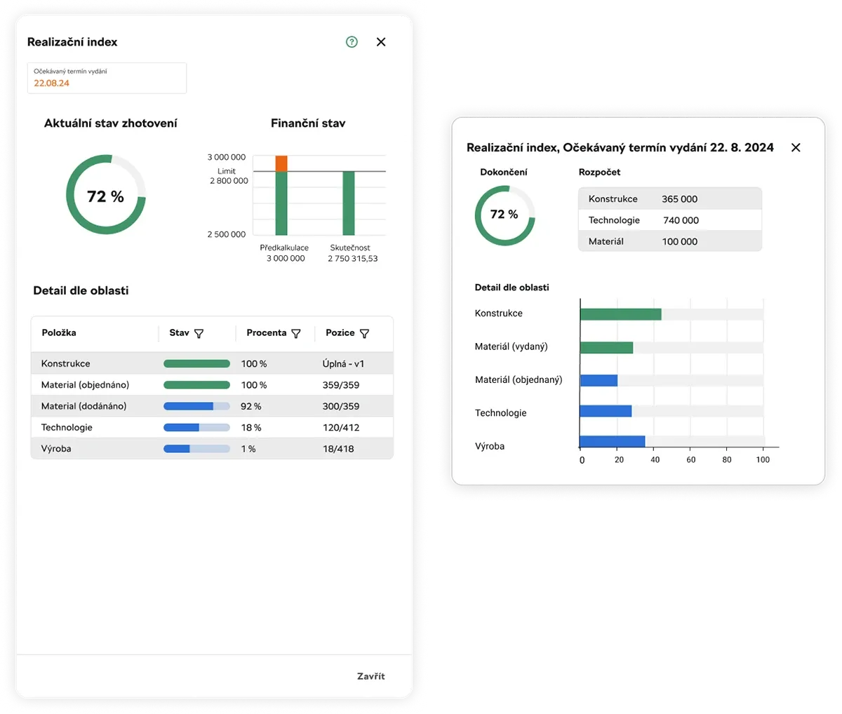
The problem: Confusing tables with large amounts of data. Operators had to search for what mattered among everything else.

Solution: Rebuilding the tables into a modular grid with smart filtering and anchored primary data.

Why: Primary data has to stay visible even while scrolling. Filtering narrows the data down to what the operator is actually dealing with.

02

Introducing a status hierarchy

The problem: Error and warning messages looked similar and were easy to miss.

Solution: A clear visual system for error and warning messages that immediately alerts users to a problem on the production floor.

Why: On the production floor, reaction speed decides outcomes. Status has to be readable at a glance, not after reading the text.

03

Design system alignment

The problem: Screens were built separately and controls differed from module to module.

Solution: Ensuring visual and functional consistency with Škoda Auto's corporate standards, plus a complete component library in Figma.

Why: The same element should behave the same way everywhere. Developers also get finished components instead of individual screens.

Touch login screen for the ŠKODA Academy
Škoda Auto — PPS G2 — screenshots

Results

The new design brought greater clarity to complex processes, significantly shortened onboarding time for new staff, and simplified handoff to the development team thanks to a complete component library in Figma.

Gallery

More screens

Examples of other screens designed as part of Škoda Auto's unified design system.

Full project on Behance
404 'page not found' design in the Škoda Auto style
404 page
Touch login screen for the ŠKODA Academy
ŠKODA Academy · login
“I had the chance to work with Kristýna on several projects and I really value her professional approach to UI design. She sticks closely to agreed rules and designs, yet is also able to bring her own creative ideas when given free rein. Her work in Figma is at a senior level, and given a clear brief she delivers excellent results in a short amount of time.”

Matúš Zarzycki

Business Analyst, ŠKODA AUTO

Related services

I also offer this as a standalone service

Let's talk about your project

Book a call

Email · nogolovakristyna@gmail.com